
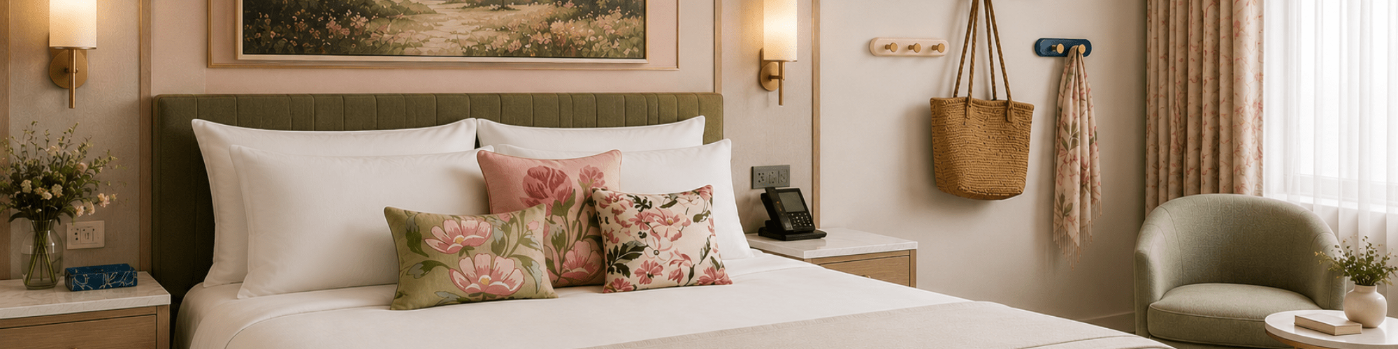
For years, many hotel guestrooms leaned heavily into safe neutrals. Taupes. Charcoals. Warm woods. Soft stone palettes designed to appeal to as many guests as possible across as many years as possible.
That approach still has value. Neutral guestrooms scale well, age gracefully, and support long renovation cycles.
But increasingly, hotels are looking for ways to make guestrooms feel less interchangeable and more memorable.
The shift we’re seeing is not toward overly themed spaces or trend-heavy interiors. It’s toward intentional moments of warmth, contrast, and personality layered into the guest experience through smaller details.
In many cases, color is entering the guestroom through the pieces guests interact with most often.
Start With the Details
Introducing color into a guestroom does not require replacing every finish in the space.
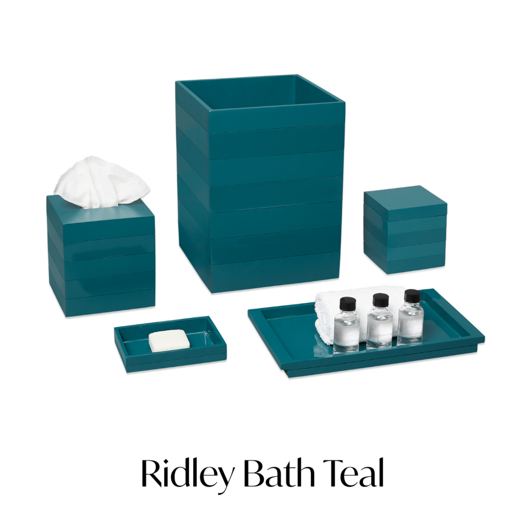
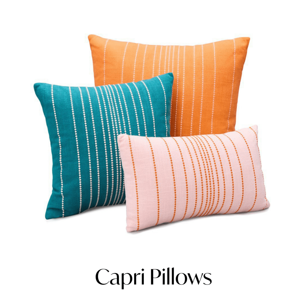
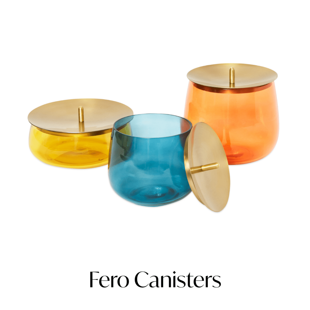
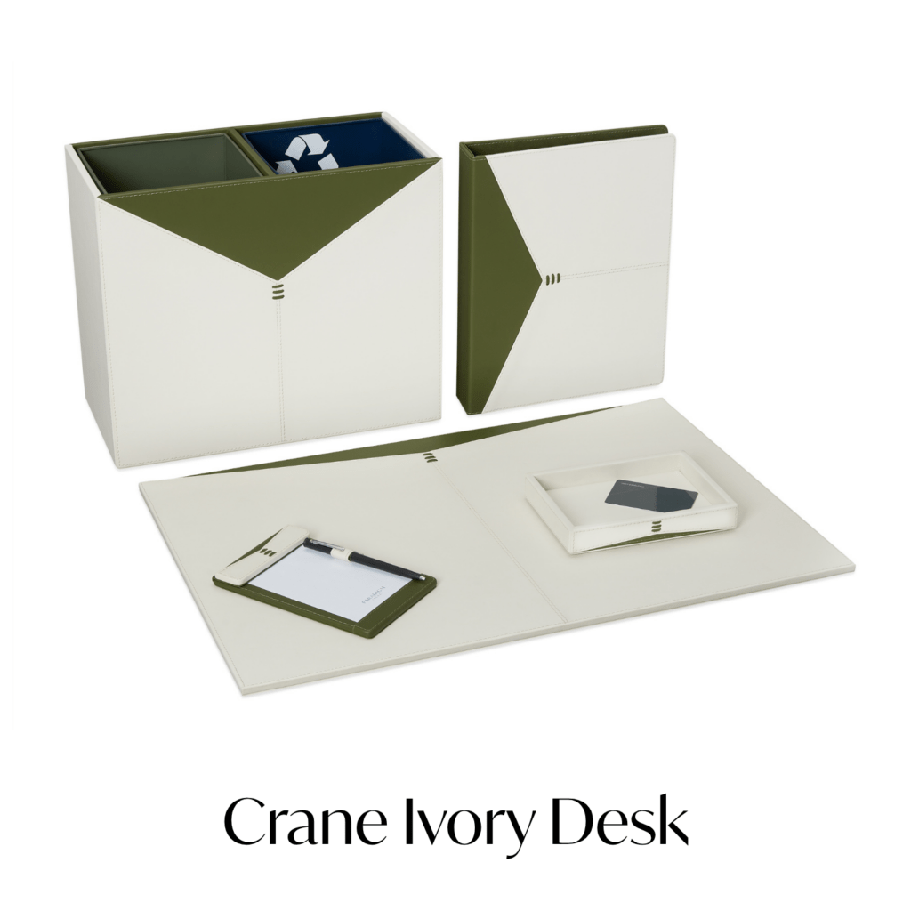
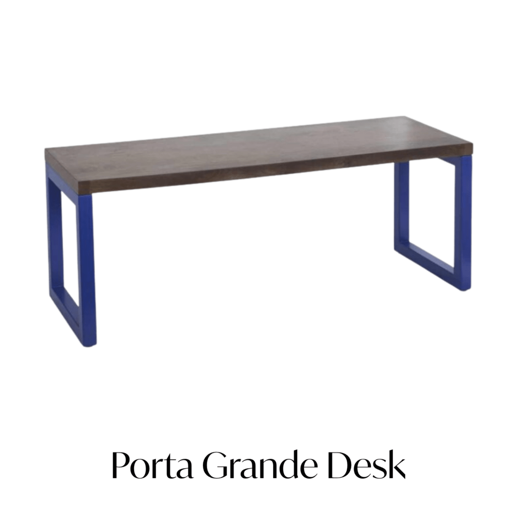
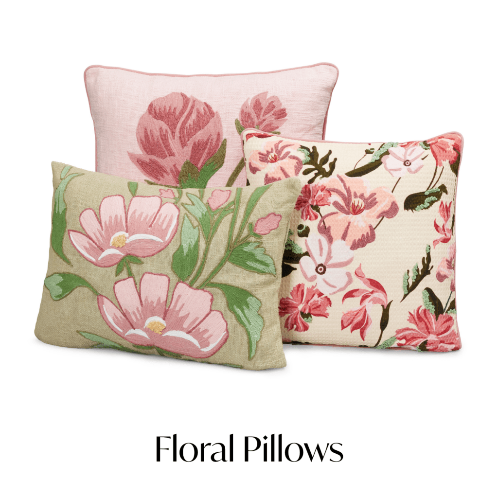
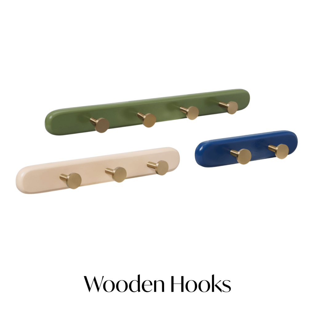
Often, the strongest results come from smaller operational accessories layered into an otherwise restrained palette. Bath collections. Decorative storage. Accent pillows. Desk accessories. A luggage rack that feels a little less expected than standard black metal.
These pieces help guestrooms feel more considered without forcing a property into a complete redesign.
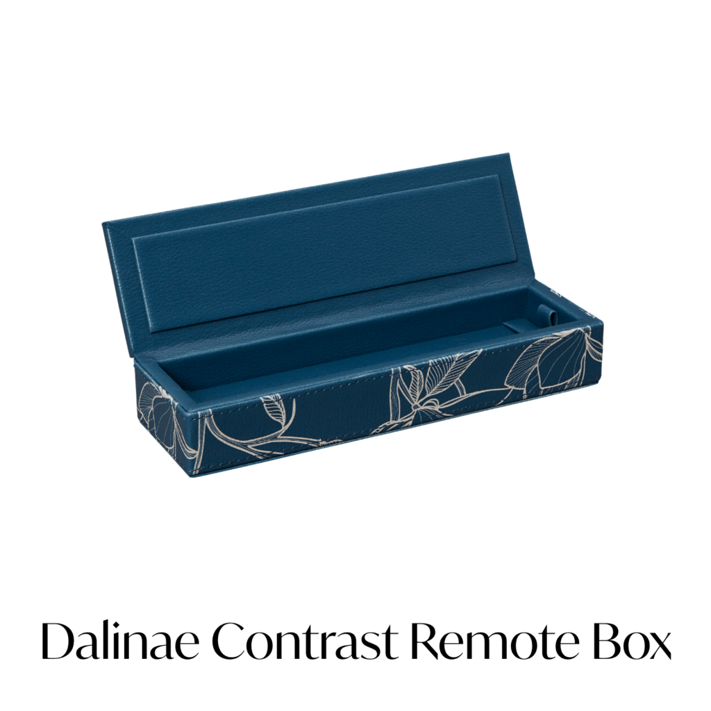
A soft blush bath collection can warm up cooler stone finishes. A teal accessory set can add depth to light oak millwork. Even a saturated accent pillow can shift the tone of a bedspread.
The guestroom equivalent of swapping accessories rather than rebuilding the wardrobe.
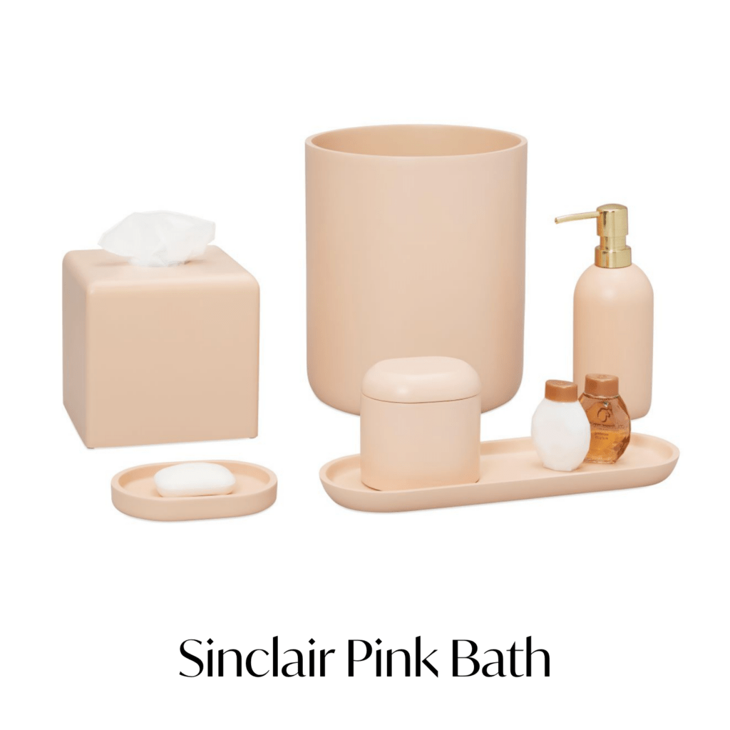
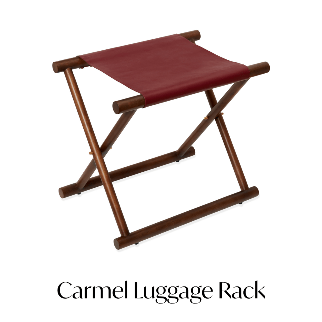
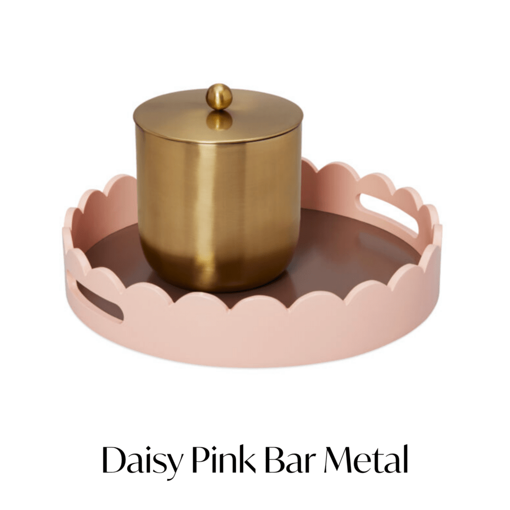
Color Works Best When It Feels Connected
The guestrooms that handle color well rarely feel random.
The palette usually ties back to something larger within the property experience. Sometimes that connection comes from location. Sometimes from surrounding architecture, local materials, wellness influences, or brand personality.
We’re seeing hotels move toward palettes that feel softer, more residential, and more layered rather than heavily corporate or overly minimal.
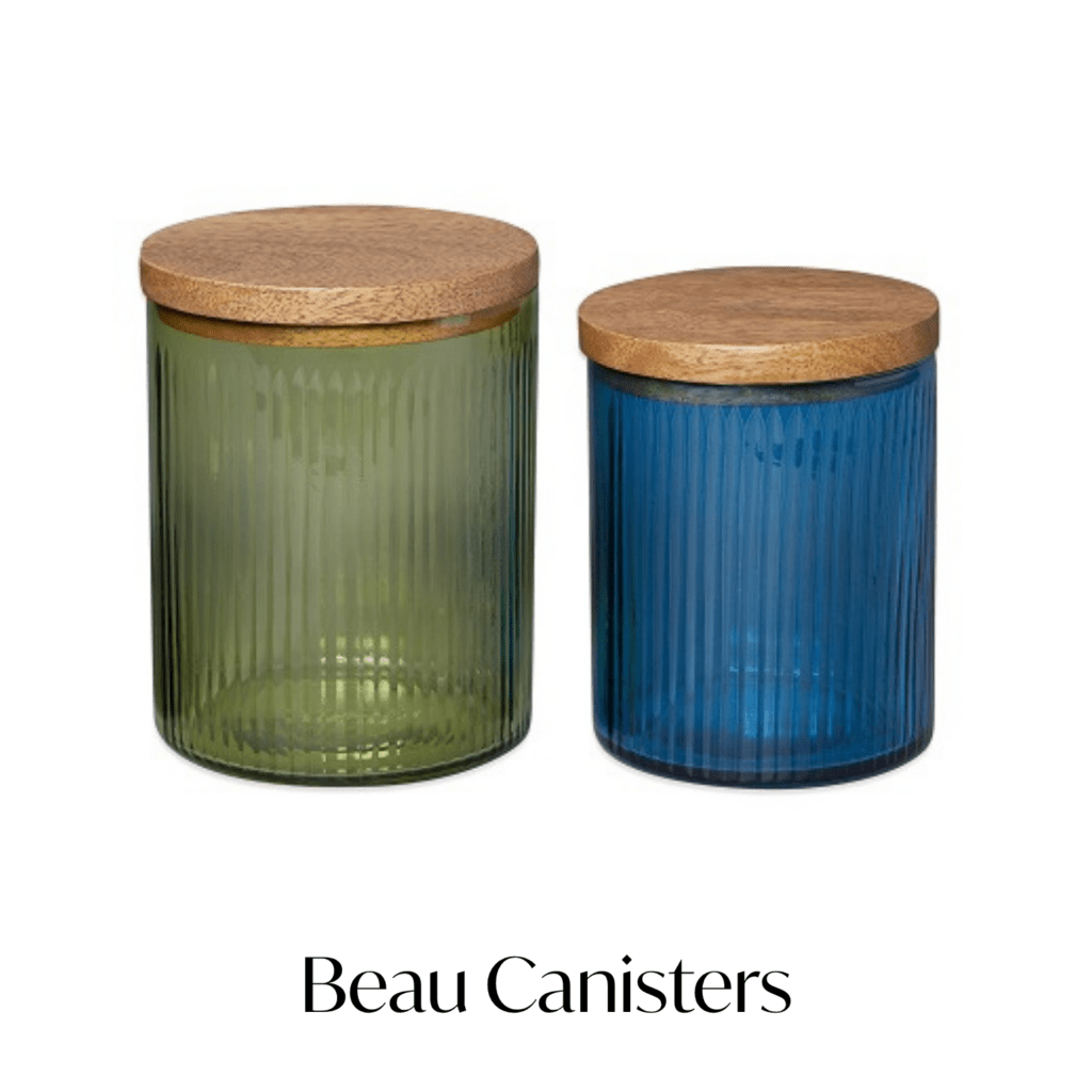
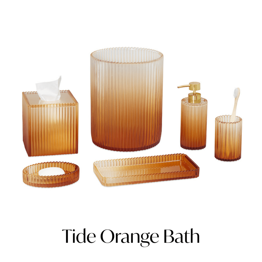
Muted pinks. Sage greens. Washed blues. Amber glass. Warmer tonal contrasts that introduce personality without overwhelming the space.
Texture Matters Just As Much As Color
Some of the most effective guestrooms right now are balancing color with texture and material contrast.
That might mean ribbed elements against smoother surfaces. Matte finishes beside reflective metals. Statement stitching layered into otherwise flat areas.
These combinations help guestrooms feel more dimensional, especially in spaces where the architectural palette remains intentionally restrained.
Even functional pieces can contribute to that layering effect. Hooks become accents. Storage becomes part of the visual rhythm of the room. Decorative pillows soften harder architectural lines.
The result feels less staged and more lived-in.
Where We’re Seeing Color Land Well
Some of the strongest applications right now are happening in categories that already serve a functional purpose within the guestroom:
- Bath collections
- Coffee and bar presentations
- Accent pillows
- Decorative trays
- Desk accessories
- Closet organization pieces
These categories naturally allow hotels to introduce contrast, texture, and personality without forcing the room into a highly themed direction. Not loud enough to dominate the room. Just enough to keep the space from feeling forgettable.
Personality Without Chaos
Hotels today are balancing a difficult equation. Guests want spaces that feel warm, memorable, and individual, while operators still need consistency across guestrooms, brands, and portfolios.
Thoughtful color helps bridge that gap. Not through excess; through placement.
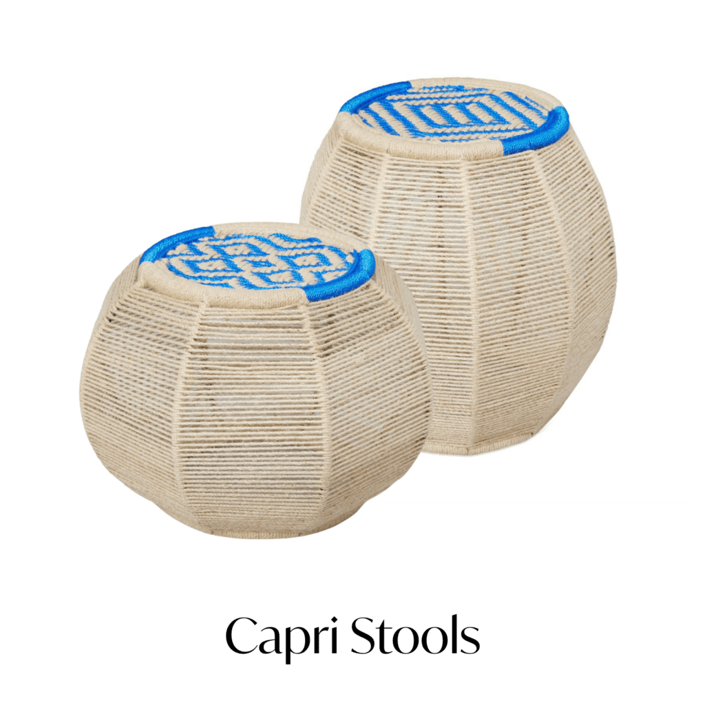
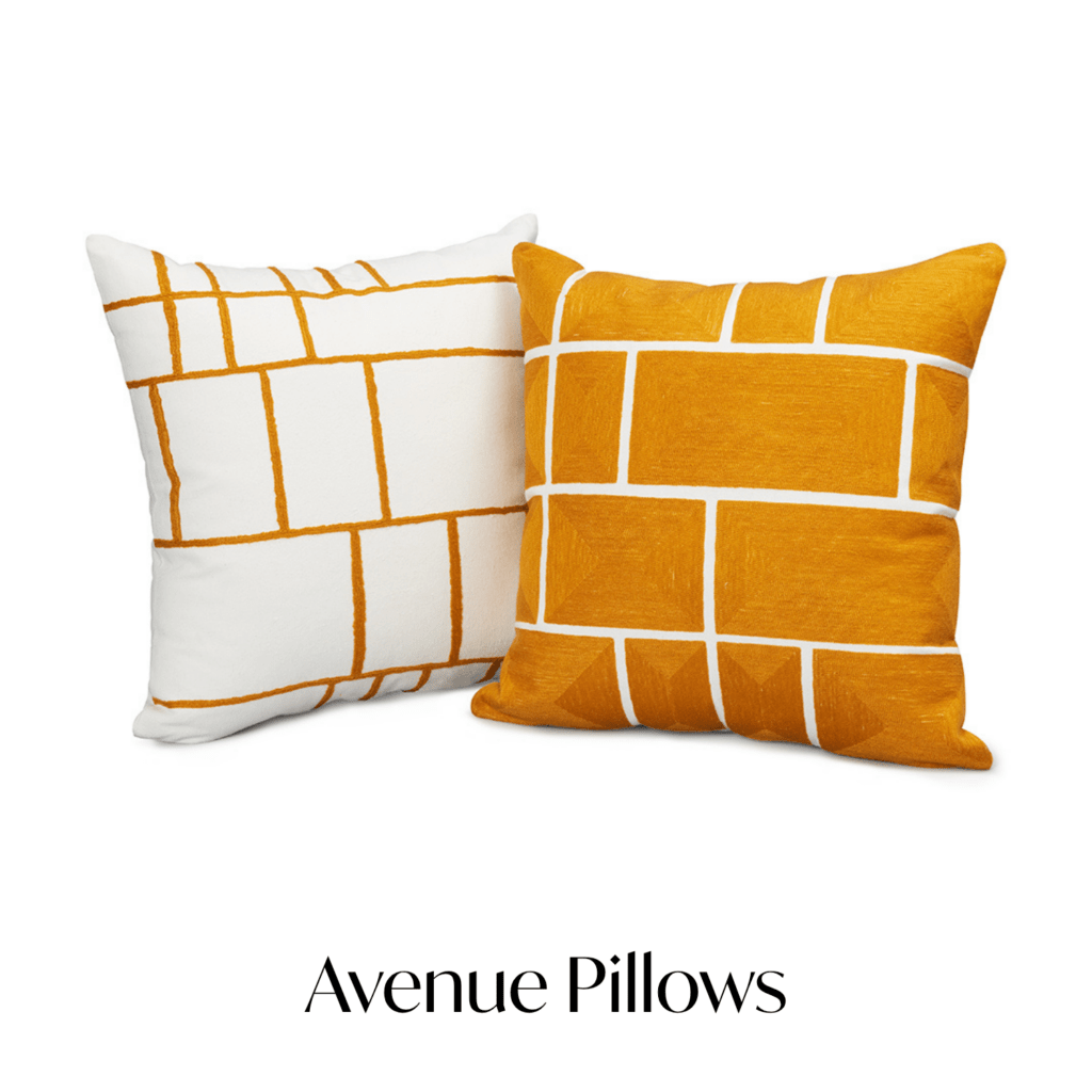
An orange glass-like resin bath collection against pale stone. Hand-woven pieces beside warm wood. An embroidered accent pillow softening a structured seating area. Accessories that introduce warmth into an otherwise neutral space.
Sometimes the smallest detail in the room becomes the thing guests remember most.
Lead Times and Customization: What Hotel Buyers Should Know Before Ordering OS&E / FF&E.